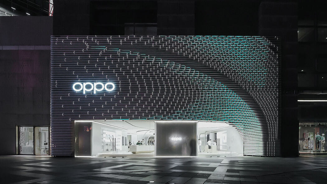
Recently designed by Unstudio, this futuristic 606m2 OPPO Guangzhou Super Flagship Store is located at Zhengjia Plaza in the Tianhe district of Guangzhou, China.
Description
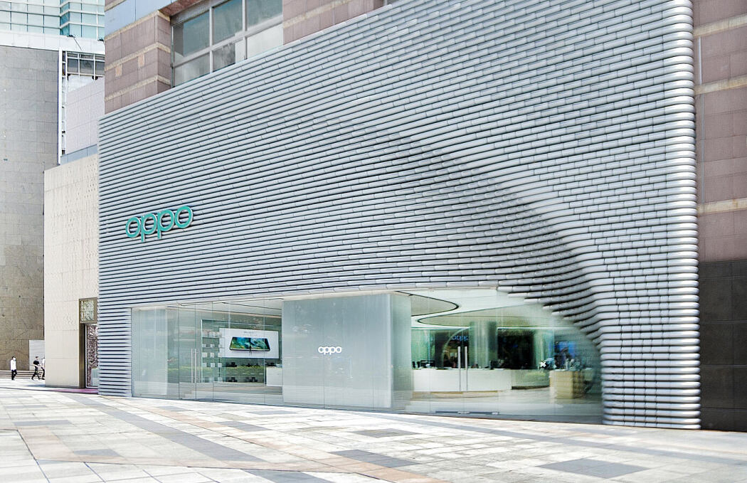
With its 300m2 new facade, the 606m2 OPPO Guangzhou Super Flagship Store is located at Zhengjia Plaza in the Tianhe district of Guangzhou.
For OPPO, it was essential that the design for the store reflect the philosophy of the brand, while aligning to the company’s existing design ethos. As such, a total brand experience had to be created for the customers that was highly tailored to OPPO.
The aim was to create a design that would become an integral and recognisable part of OPPO’s overall branding and a valued experience that OPPO’s customers will want to engage with and return to. For OPPO customers, existing and new, the newly designed Guangzhou store provides a venue where they can familiarise themselves with – and get excited about – OPPO’s products.
Design concept – Urban Park
Guangzhou is a wonderful mix of a historical and a modern, forward-looking city. The challenge of designing an OPPO store within this city is to develop a contextual reaction and strategy that respects the qualities of the city, while also representing OPPO’s brand values.
With the ambition to create a gathering space that blurs the boundaries between public space and commerce for OPPO’s customers, UNStudio introduced an ‘Urban Park’ concept. This concept creates an inclusive environment that meets the behavioral needs of the various people who visit the store.
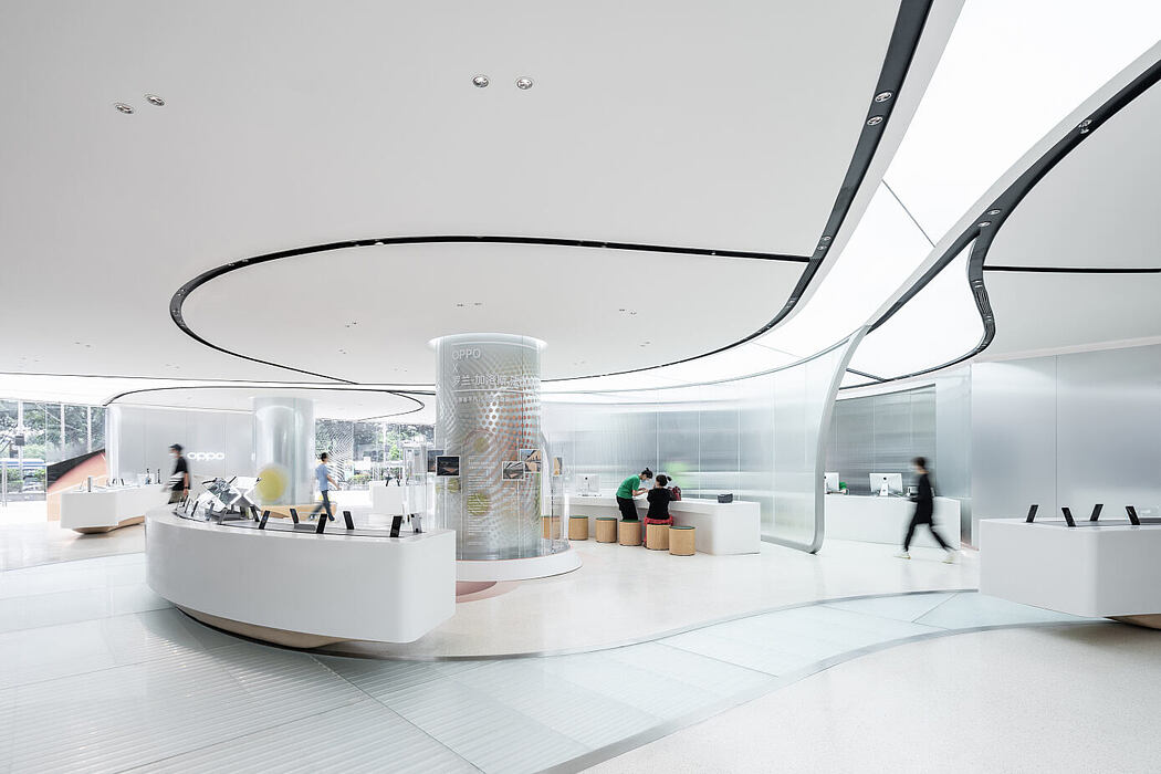
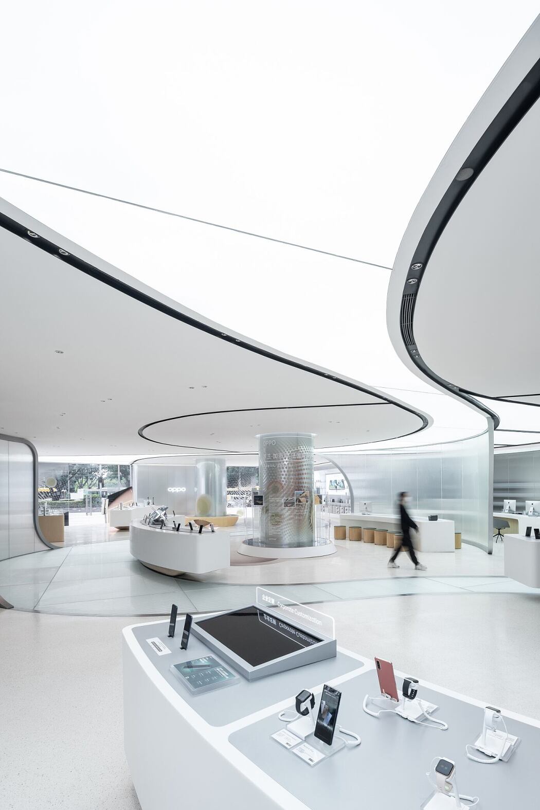
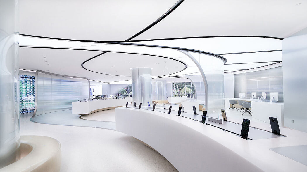
The interior is designed as a ‘borderless’ interactive environment, where meandering routes lead visitors through an array of ‘display zones’, thereby creating different rhythms of motion and allowing customers to browse, take their time, pause and try out the products within the store.
The Facade – the modular tube
The design for the Guangzhou OPPO flagship store is approached through a keen focus on craftsmanship, alongside material choices that add a contemporary twist to the vernacular architecture of the city.
Situated along a main thoroughfare, the facade design needed to provide the store with a bold and recognizable visual identity. As a result, a sliced extruded tube component was chosen as the main module, inspired by bamboo – an important source of food, clothing, housing, and transportation for people in Guangzhou in ancient times.
This metallic tube is also a 3D interpretation of the ‘O’ in OPPO. This dimensional transformation results in a cylindrical tube, into which a cut is added in order to obtain a truncated cylinder. This cylindrical form is repeated in varying lengths and curvatures throughout the facade, creating a reference to both the brand and to technology.
For the overall composition of the facade elements, multiple geometric strategies were studied. Following the exploration of different volumetric options, a large, sweeping folding gesture was chosen which echoes the corner curve of the OPPO brand logo, while guiding visitors towards the entrance to the store.
Programmable lighting embedded within each tube create an overall facade effect of dynamism and vibrancy. The result is an optical rhythmic motion across the façade.
The Interior – Fluid, continuous geometry
Achieving a fluid space in a flowing, uninterrupted movement – where an intuitive sequence of different areas enables customers to experience and interact with the products – was one of the key aims of the interior design.
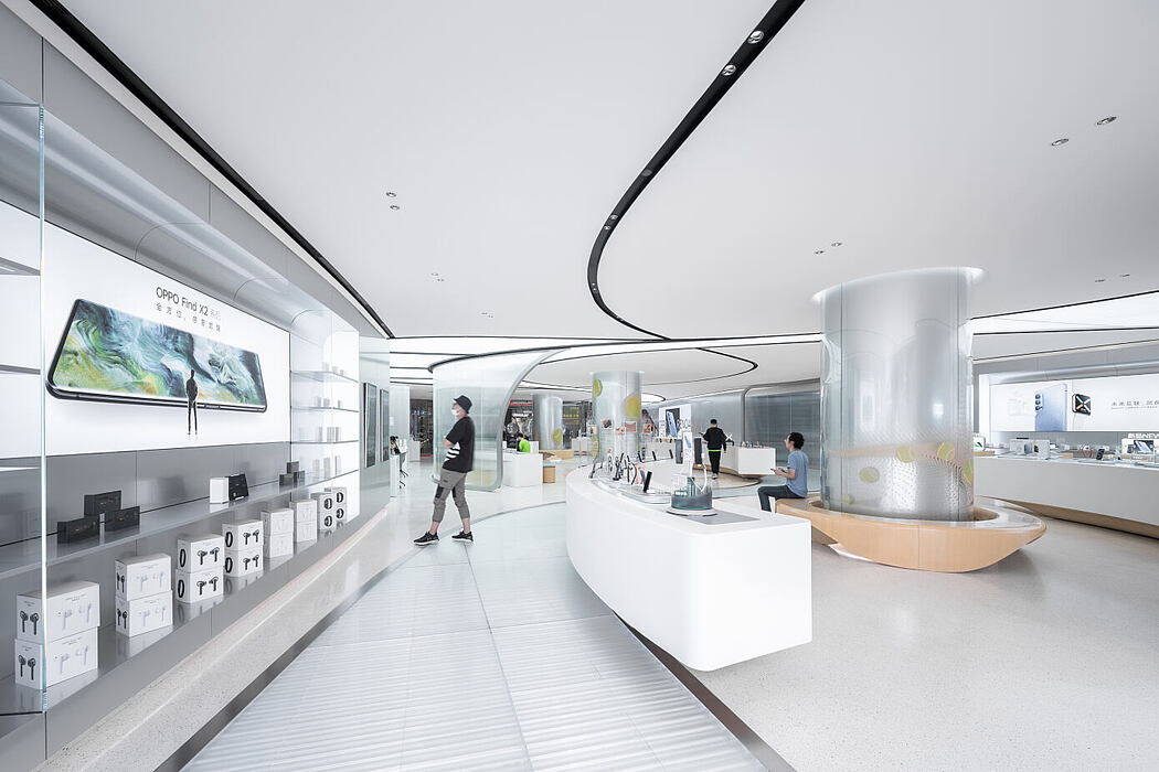
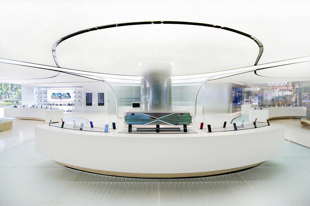
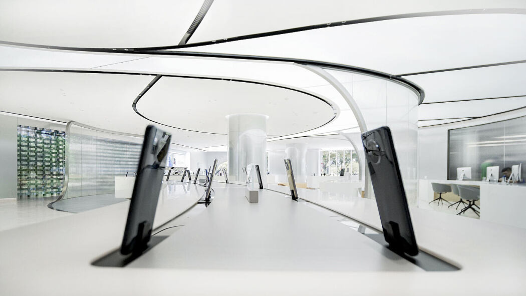
The interior space is defined by two main experiential zones: PULSE and EVOLUTION. In the PULSE area the main phone displays act as a strong focal point, while the EVOLUTION areas, in contrast, enable different experiences and accommodate social and interactive zones.
The winding circulation paths weave visitors through these zones, and along targeted seating that provide comfortable areas for customers to charge their phones, test new products, and socialise.
The store also provides customers with a playful ‘instagrammable’ experience zone, where they are also encouraged to discover the features of the phone’s cameras by taking photos and selfies.
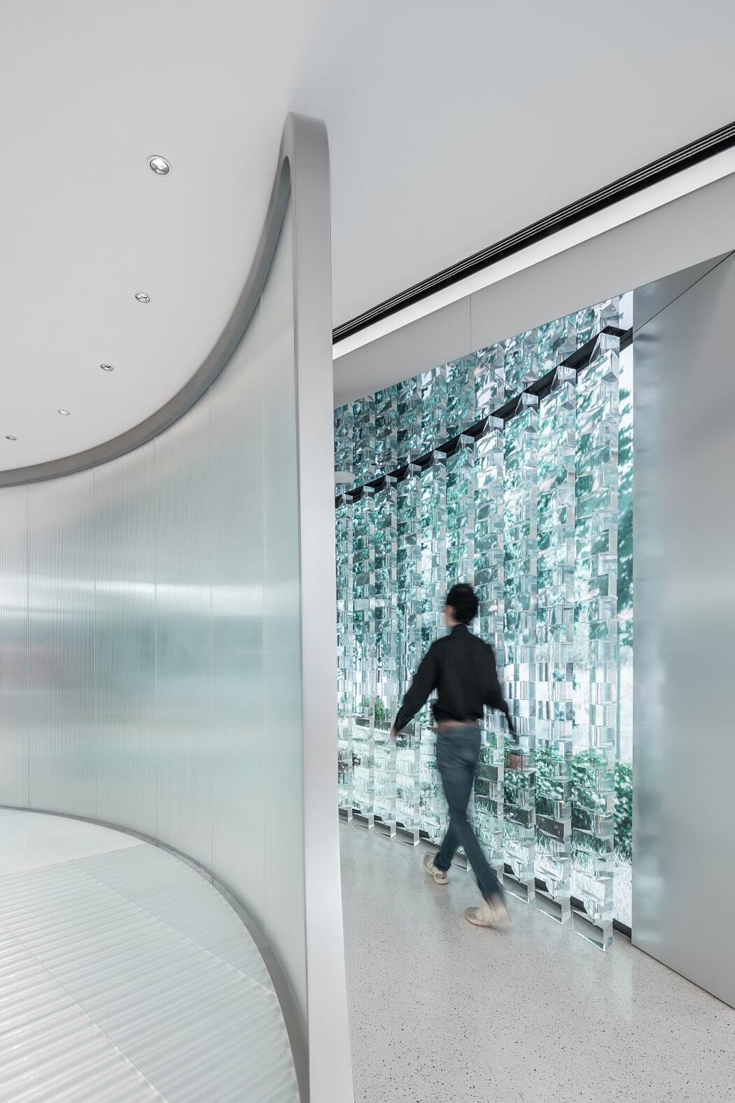
The accentuation of fluid forms with natural wood in a muted palette articulate the interior. Silver anodized aluminum panels juxtapose the rippled translucent glass screens and wall of acrylic prisms. The result is a constant play on perception of subtly layered changes of depth throughout the interior, and balance between solid and transparent, heavy and light, cold and warm.
White terrazzo embedded with speckles of ‘Oppo green’ create the meandering paths through the store, while integrated ‘pathways’ of lighting in the ceiling mimic this fluid flow and frame the different areas and displays from above. These pathways in the floor and ceiling further serve to guide visitors intuitively along various routes as they wander through and around the space.
Photography by CreatAR Images
The post Oppo Store Guangzhou by Unstudio first appeared on HomeAdore.
from HomeAdore https://ift.tt/3qZXknH
Comments
Post a Comment